Data Analysis Visualizations
Creating Graphics using Tableau
Dataset: Yu, A. Z., et al. (2016). Pantheon 1.0, a manually verified dataset of globally famous biographies. Scientific Data 2:150075. doi: 10.1038/sdata.2015.75
Background/Assignment: As part of an information visualization class, we were presented with an intriguing assignment centered around the "Pantheon: A Dataset of Globally Famous Biographies," meticulously compiled by Yu et al. This dataset encompasses an extensive list of renowned individuals whose biographies have been verified manually and are featured in Wikipedia articles across more than 25 diverse languages. Our creative challenge was to craft a captivating visualization that effectively addresses a question of our own choosing, leveraging the rich insights hidden within this wealth of information.
Data Exploration: I first needed to understand what the data looked like. By loading the dataset into Tableau, I got an initial sense of the different categories of the data. The attributes for each entry were fairly standard, encompassing details such as their name, general location, birthplace, residence, gender, occupation, and key statistics from their Wikipedia pages, such as page views. Immediately, I was drawn to the gender aspect of this data. How many women were included in this dataset? I had to know.
“ History is written by the victors.”
5 Design Sheet Method: After exploring the data and developing a main area of focus, I started sketching out my various ideas using the five-design sheet method. This method is common in design work and follows a logical progression through sketches to help narrow down possible design ideas. Sheet 1 starts broad and encourages creativity, while the following sheets narrow the design through various iterations until the fifth sheet produces the final realization design. Here are just a few of my sketch sheets
This common quote captured my attention while working through this project. While this certainly rings true regarding the traditional sense of “victor”; those who win in battle and burn through the opposing cities, it also rings sharply in regards to a quieter, omnipresent force that has shaped the course of history time and time again. If you think about it, men have been ‘winning’ for awfully long. So, it would make sense then that they are who we think of when we think back to great historical figures. But is this actually true? Are there more men preserved in history as icons and figureheads? These were the questions I focused on when creating my visualization. How does gender play a role in this dataset? And ultimately, what story does this then paint?
Implementation/Final Visualization: Finally, the time for implantation was here. As I focused heavily on gender, I wanted to portray any differences between the two in various ways linked to each other. To do this, I centered all of my visualizations around two colors. This way, it is easy to see differences right away across all of the graphs. It also made linking between my visualizations easy, as there was always a common thread pulling them together. I wanted my visualization to have a lot of interactions as I believe exploring the data can lead to new and interesting discoveries. I accomplished this by allowing each graph to be used as a filter connecting to the others. However, the initial visualization (before anything is clicked) also presents a unique and intriguing insight into the dataset, so it is easily catered to the user's desire. I also included a webpage that can be scrolled through in the visualization and clicked to an external link that I think addresses the main questions interestingly. It addresses modern and historical discrepancies in how history is preserved for the different genders on Wikipedia.
Showcasing the different filters available: By Occupation, By Birth Year, and by Gender
Creating Graphics using Sketching Apps
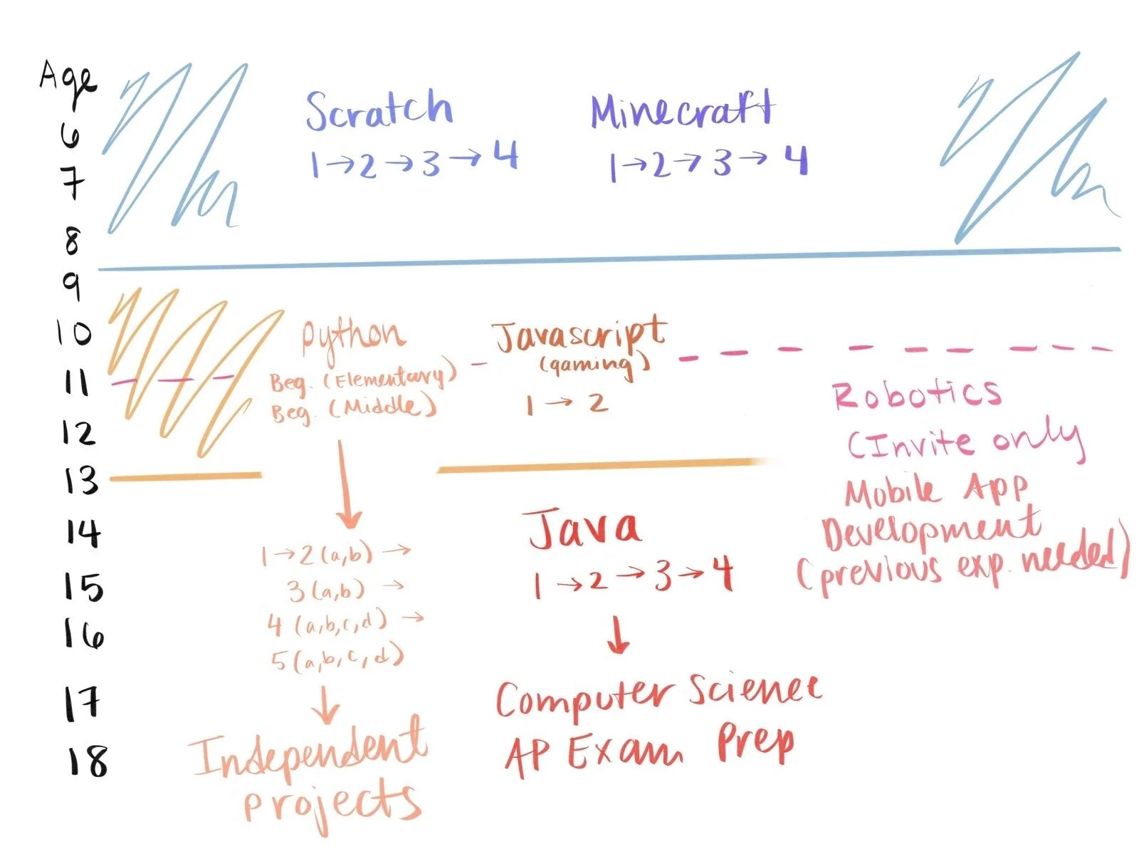
Goal: Create a Graphic that organizes the Classes into Age Groups
The Problem: A common complaint about Penguin Coding School’s Website is that it is confusing and hard to figure out what class to sign up for. Parents with little coding experience don’t know what the different classes teach and trying to decide which class is appropriate for their child is difficult. This affects Penguin Coding School’s conversion rate; we want more parents to sign up for classes and thus we need to make it easier for them to find the right one. And thus I set about trying to convey this information in one easy to understand graphic.


